ShopDreamUp AI ArtDreamUp

Deviation Actions


Suggested Deviants


Suggested Collections


You Might Like…


Featured in Groups


Description
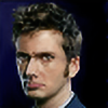
This is the tenth Doctor, David Tennant. Hand drawn about 6 hours.
Image size
2528x3424px 2.89 MB
© 2010 - 2024 JunebugHardee
Comments380
Join the community to add your comment. Already a deviant? Log In
It's clear what makes this piece--the face! Goodness gracious that face. It's almost a caricature the way the eyes and eyebrows are so extreme and exaggerated. It's brilliant because everybody who knows Tennant knows that to be his most active and unique facial area. You did a brilliant job of using that to make a brilliant focus and a unique take on this portrait.
Other absolutely brilliant points are the detail shadings of spots that some might have considered unimportant. The wrist and the neck are two such examples. The shadow from the glasses is another, potentially difficult aspect of the shading that you absolutely rose to the challenge on! bravo!
Now the weak points. It's interesting because i didn't even notice until i read a previous critique, but the suit is rather sloppily done. You're obviously very good at creating form and space with shading and shape. I mean, look at the hand and the hair! beautiful! So why is the suit so lifeless? my guess is that it was just the least important aspect to you. and actually, that's a perfectly acceptable standpoint. When something in your picture isn't meant to be the focus, it should be treated accordingly. That's not to say you can be lazy. Just that there's nothing wrong with managing your time, and deciding what aspects of a piece really need your focus, and which ones don't. I personally thing the stripes on his suit are one of those aspects that shouldn't really matter.
Well, I feel like i rambled forever trying to explain myself on that one. Okay, last bit: my ratings.
Vision-4 ; I've never been quite sure what other people mean by this catagory but i take it to be a measure of how much thought must have gone into the idea of a piece. This piece is a unique portrait of a man of whom over ten thousand portraits probably exist out there. Your choice of what reference to use and how to portray it made this picture.
Originality-5! ; This rating is very related to the previous one. The originality of this piece is remarkable. It's hard to make a portrait your own sometimes. You did a great job of taking his face, and throwin creative licenses all up in it. ALL the stars for you!
Technique-4.5 ; as i have previously spoke on, you used shading beautifully in this piece to create shape and texture and emotion and foreshortening even--you just did a brilliant job. I felt compelled to shy from complete 5 stars on account of a few minor things (i.e. the big splotch of unstructured black on the suit. The shading reads well, but looks sloppy.) But still, on the whole your mastery of this technique is displayed clearly in this work.
Impact- 5 ; When people look at this picture they instantly love the unique take on it. The contrasts of light and dark and those brilliantly done eyes stick with people. ALL the stars for you! AGAIN!
All in all, this is a beautiful piece that puts a new spin on a face we all know and love. It displays your ability and creativity very well. I give it a 9.5 out of 10. Very good work!